
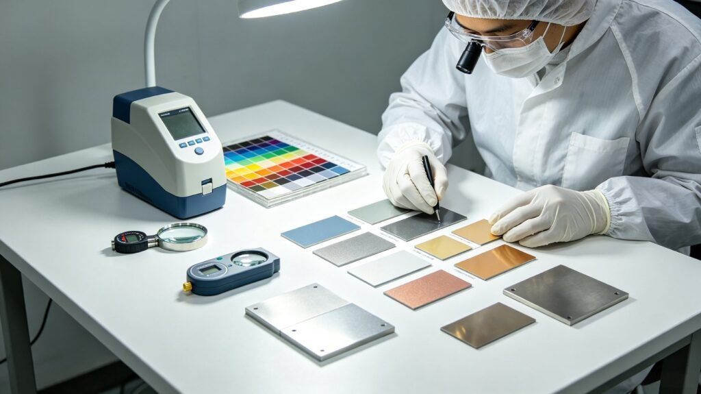
Powder Coating Color Matching: RAL, Pantone and Custom Colors
Getting the color right is one of the most common questions B2B buyers ask before placing a powder coating order. A color mismatch between batches can stop a production line, so it pays to understand how RAL, Pantone and custom matching work in practice – and what to send us to get an exact match the first time.
Key Takeaways
- RAL Classic is the standard system for European powder coating; Pantone is used to match brand colors.
- A physical approved sample, not a screen or a photo, is the reference that protects both sides.
- Gloss and texture change perceived color, so they must be specified with the color code.
- Send color reference, gloss, finish, substrate, service environment and annual quantity to get an accurate match.
Why Color Matching Matters
In most commercial orders, color is a contract requirement rather than a preference. Buyers specify a RAL or Pantone code, approve a physical sample, and expect every batch to stay within a small tolerance of that approval. Without a clear reference and agreed tolerance, small pigment or cure variations can look like a serious defect – especially on large, side-by-side panels.
RAL Classic: The Industry Standard
RAL Classic is the most widely used color system for powder coating in Europe and much of the world. It contains over 200 standard colors, each identified by a four-digit code such as RAL 5015 Sky Blue or RAL 9005 Jet Black. RAL codes define the hue, but not the gloss level – the same RAL number can be supplied in matte, satin or high-gloss, so always state the gloss level together with the code.
Pantone: Matching Brand Colors
Pantone (PMS) codes are common when buyers want to match a brand color, logo or packaging. Many Pantone colors can be reproduced in powder coating, but not all – fluorescent, metallic and some very saturated shades are limited by the pigments that can survive the extrusion and curing process. When a color is not achievable, our engineers propose the closest match or a custom formulation.
Custom Color Matching
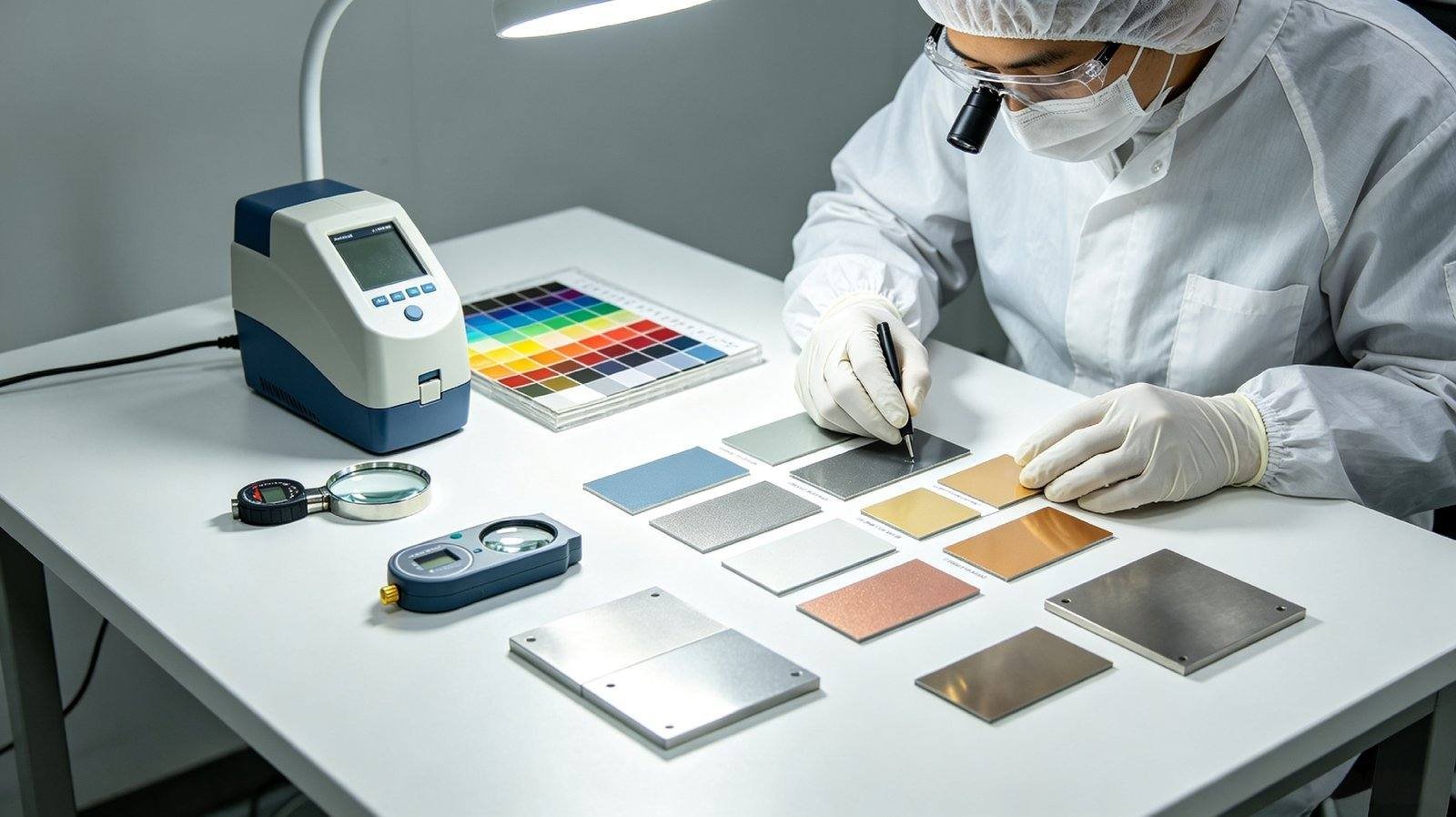
For custom colors, the most reliable reference is a physical sample – a painted panel, a plastic part, or even a piece of paper. We read the sample with a spectrophotometer, adjust the pigment recipe, and spray a test panel for visual approval in daylight. A digital photo helps but is not enough on its own: screens and cameras shift colors, and metallic or textured finishes cannot be judged from a photo.
Finish and Texture Change the Perceived Color
Gloss and texture affect how a color looks. A high-gloss surface appears deeper and more saturated; a matte or textured surface appears lighter and softer. Metallic powders contain aluminum flakes that change appearance with spray angle and film thickness. For this reason, specify color code, gloss level and finish (smooth, texture, metallic) together – never the color alone.
What to Include in Your Inquiry
- Color reference: RAL / Pantone code, or a physical sample
- Gloss level: high-gloss, semi-gloss, satin or matte
- Finish: smooth, textured (fine/coarse) or metallic
- Substrate: steel, aluminum, galvanized, cast iron, etc.
- Application and environment: indoor, outdoor, chemical exposure
- Estimated quantity per color per year
How to Get a Sample Panel
Send us your color reference and the details above. We match the color, spray a sample panel, and ship it to you for approval before production. This free sample step is the best way to guarantee the color is right before you commit to a full batch.
Frequently Asked Questions
How do I specify a color for powder coating?
Give the RAL or Pantone code or a physical sample, then state gloss level, finish, substrate and the environment the part will see, so the color and the system are approved together.
Can you match a color from a photo?
Only approximately. Cameras, screens and lighting shift color, and photos cannot show flake size or sparkle, so a physical sample is needed for an exact match.
Why does the same RAL color look different in matte and gloss?
Gloss and texture change how light reflects from the surface, so the same pigment reads lighter or darker. Gloss must be agreed alongside the color code.
Need More Information?
Our engineers can help you choose the right powder coating system, color and finish for your project.